You want to get the most out of your lessons, right?
Look honey, it's just a fact that women learn the piano better. It's not some innate talent gap, it's because they get taught better. They get more attention from their teachers, get better teachers, and get more free teaching time.
I know you don't exactly trust my magic, but do this for me at least once. Let me change you into a girl and you take a couple lessons.
A quick word about this format (Tumblr Rejects). As I've said, Tumblr lets me work with much smaller images. Especially when they're animated gifs like above. My normal cap size had a width of about 1200 pixels. My header graphics on this blog for Caps, Obscurra, or anything, are 740 pixels wide. These animated gifs are only 500 pixels wide. Now, I've made header graphics from images around this size before, but I'm always disappointed by them. They just distort to much when stretched and look bad. I'd done it before because it was rare and not a trend. These posts, however, are likely to become common.
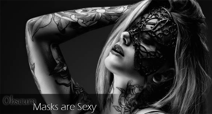
I want the header graphics to be easily identifiable. Cap posts (as well as more general posts) are individualized with the title somewhere over the image. Obscura posts has the 'Obscura' and title over a background line that fades out from left to right. Fable posts have a similar layout to the Obscura posts but aren't lined up on the bottom of the header. So to keep Tumblr Rejects posts easily identifiable from other posts and consistent I'm going to simply reverse the Obscura style. Have them right justified instead of left.
Examples of Cap/General, Obscura, Fable, and Tumblr Reject headers:
That format would work perfectly, if all the images were at or at least near 740 pixels wide. I just find it highly unlikely that that's going to be the case. SO... the current thought is to have a generic background that the smaller image can sit on. The images will be various sizes and ratios, so they'll look quite different from each other, but they'll continue to have that right justified title:
I know this probably doesn't mean much to all of you, but let's face it... I'm the design gal! This stuff peaks my interest almost as much as making the Tumblr/Obscura/Fable/Cap. Anyway, I hope you enjoy!


No comments:
Post a Comment