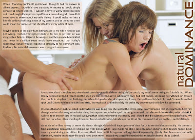
It's something that can't be faked!
It's been awhile since I just let go and made a nice quick fun down in the gutter dirty smutty cap. I've been in the mood, but even when I tried the last few times, I ended up with more emotional stories like "Submitting to love and submission" and "He Thought Of Everything". So when I went looking for images this morning to spark inspiration I didn't even bother with looking at solo images or even lesbian image sets. I don't know exactly why, but I look at lesbian sets, even obviously Mistress/slave lesbian sets as a little cleaner than man/woman sets.
And when I came across this image set, and specifically her expression in the image I used.... well I knew I had my winner. The story is almost entirely fluff, just to set up the scene. I wanted the protagonist to 'get what he deserves' so I made him cruel toward his wife, but I still wanted her to be trapped as well... so a magic book seemed like a good tool to use. He could change her into a submissive woman and that submissiveness leads to his transformation at the hands of a stranger. I guess I've been exploring submissive/dominant themes as of late, so it naturally made it's way in here.
As a serious cap that I put a lot of effort into... this doesn't quite meet my normal expectations. I'm sure I could have gone on longer with the story and told a more detailed story of natural dominance vs magically enhanced dominance... but that's what's happened with most of my other 'dirty' caps. They went into story telling mode and took away from their raw smuttiness. So I let the story have it's holes and just let myself enjoy the image.
Of course I hope you enjoy it as well.
While I have your attention though, I wanted to talk about my recent minor re-design. I didn't get many responses when I changed the blog around (I'm still grateful for Jennifer and Rauk's input), and figured it went over well enough. I really REALLY like the new square preview images... I think they can be used to hint at the cap without spilling the beans and they give the blog a much cleaner more consistent look.
But since I've started using the new preview images, page views have dropped like a rock. I know there is a natural up and down cycle to page views, but I'm also getting better at predicting which caps will bring in the viewers. Caps like "Staying in Character" would often get a lot of page views. Even semi emotional caps like "Submitting to love and submission" and "He Thought Of Everything", would get a lot of page views especially when I use a more explicit preview image. If I had to guess, I'd guess that "Staying in Character" by now should have received about 3500 page views, while "Submitting to love and submission" and"He Thought Of Everything" should have received over 4000.
But as of today those three have received 2587, 2347, and 2382 page views. The two LtSL caps I've made recently have gotten 687 and 507 page views, and I'd normally expect them to be between 800 and 1000.
Overall I'd say my page views are down close to 50%. I know it's guess work on my part, but its educated guess work. If it were just for one or two caps, I'd say I just predicted too high of a guess... but it's been consistently wrong since the new preview images.
Understand, I'm not complaining about any type of 'lack of attention'. What I'm concerned about is a little bit of design work making less people get to my caps. If people are honestly not as interested in the caps, then I can accept that. I'm not going to change the type of caps I enjoy making just to get more people to look at them. That's just counter intuitive. But if the way I display said caps is keeping people away, then it does bear some thought.
So I'm going to be keeping an eye on the page views over the next week or so. It's always hard to judge, and I would like more data points to consider before I think of changing back. But if I keep up a good level of posts and don't see the page views return to what I think should be normal, I'll probably be ditching the stylized preview images.


Although they have different pictures in them, the foggy black and white thematic design of the previews MIGHT look the same to someone just glancing quickly, especially if they are seeing the graphic in someone else's blog roll as a tiny thumbnail.
ReplyDeletePerhaps that is why there are less drive-by hits. The people that follow all your work are still clicking, but the preview photo isn't pulling them in?
Love the Cap, Caitlyn.....but....
ReplyDeletePersonally, if I had that spell book, I wouldn't have even brought someone else into the mix. I would've changed myself into the feminine being I desire to be, and "suggest" to my wife that she become a lesbian lover to me.
I don't understand the complaint. This outcome sounds wonderful to me.
ReplyDeleteJust for the record, I've always enjoyed your work!
ReplyDeleteYour work is always excelent, I have just been going through a phase of finding it hard to fit everything in andhaven't looked at as many captions as usual (or posted them). No reflection on others, but it's hard to explain why.
ReplyDelete