


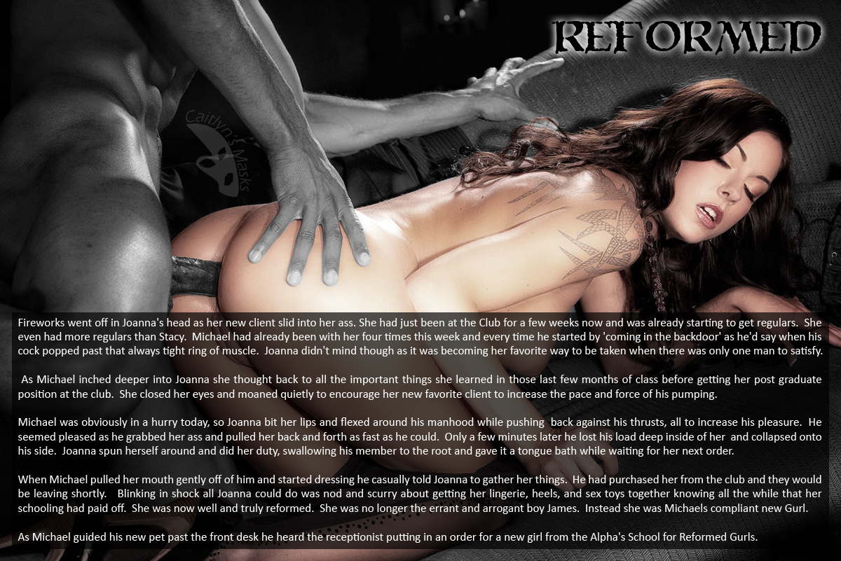
Jane had the wonderful idea of not using one of the images I posted, but both in the same story. I really liked the idea of seeing 'James' both in the middle of his reform school and afterward. But using both images would prove to be a bit problematic. The two images are photographed very differently. The first one has fairly flat lighting while the second had far more dramatic lighting. The first is shot straight on, while the second is photographed at an angle. Even the color tones are different between the two. So if I didn't manipulate them, the story would seem to have a big change. And while the story does have a dramatic change between the two panels, I still wanted it to 'feel' like one continuous story, and not two separate parts.
So my first though was to remove the color. Both images being black and white along with appropriately colored text and text boxes would go along way to making them feel like they belong together. But that didn't change the lighting or orientation of the images. I tried to fix the orientation by rotating the second image and cropping it back to a rectangular shape... but I had to crop out too much to make it work. And rotating the first image just looked bad.
So to make the images feel more similar I went back and pulled the color back into the subject. I felt that this (once I had the skin tones closer together in tone), worked. And it had the added benefit of helping identify 'James' in the first image. When I had the images colored the way I wanted I also decided to put the text over the image instead of adding a canvas for it. I figured this would help even out the orientation of the photos a bit as I would be covering up much of the bottom of the second image. Without the couch as a reference, you can forget that the image is rotated. At least I hope so.
So with a design to work with, I just had to add the story. But I found something else that needed work. While Jane's story is great, it was unbalanced toward the second panel. There was about 30% more story on that side. I really liked Jane's story, but so long as I was going to edit it (at this point I wasn't sure if I was going to pare down the second panel or beef up the first), I read through it to see if there was something more that I could add. What |I caught on to was that the two parts of the story didn't have a lot linking them. So I decided to take a balaced approach... I would add a bit more to the first panel to hopefully mirror the action in the second panel, and then pared down the second one a bit to help match the pacing set in the first.
I'm happy with the resulting cap, but as always with a collaboration I look forward to Jane's opinion. And of course I'm always open to everybody else's thoughts!
First let me say, I knew the pictures together would be a problem but wanted to try something different and figured that if anyone could make them blend together it would be you and your photoshop magic.
ReplyDeleteSecond, I know my story wasn't the greatest but after reading the first 'fleshed out' panel then the second it goes to show you why I am the reader and you are the capper.
You did a fantastic rewrite on the first panel and it is definitely missed in the second one that is in my writing style. Possibly I'm being critical on myself but time will tell.
All in all I couldn't ask for a better work to come out of my/our story and board. I think I was better with the darker story I did for the first collaboration.
Now off to read your own full caption:D
Jane
Jane,
DeleteI'm still not sure that the photos 'blend' well together, but I'm happy that you used both. The challenge of making them work together was fun and just the type of thing I was looking for.
As to the two parts... I'm not sure it was my 'fleshing out' of the first panel that makes it work better. Instead I believe that it's the content. The first panel is telling the action, but it also is the memories and thinking ahead to her future. The second panel is just a single moment.
I think writing out a single moment is far more difficult as it's harder to keep the action going without repeating phrases or going back and repeating actions.
I think the story as a whole works very well. You ARE being critical on yourself, but that's the only way that you'll improve. If you look at any good prolific cap artist you'll see someone who is critical of themselves.
I'm glad you liked it and look forward to seeing more from you!
I don't think I can put my finger on a single thing that stands out to me about this caption and that's probably what makes it great. I really like it when someone engages all of my senses with their description like you did in the first panel, it makes the cap seem so much more alive. I enjoyed the mention of the specific courses he was required to take and of her "post-graduate" work. They seem like quite dull and boring topics until you read just exactly what those courses are! Then it becomes quite naughty! Lastly, I liked the success story at the end and the sweet touch (I'm going to call it sweet). I mean, working in the club is great and all, but getting bought and brought home? I think that's pretty sweet.
ReplyDeleteI couldn't agree more Kendall. I think the story set up with a nice slow burn. It didn't start by pushing the sexual nature to the fore front, and let it just build naturally.
DeleteI saw it as sweet too. Joanna had grown into her role and getting purchased would be a reward, especially when it's from one of her favorite customers. To be honest, I'm not sure why I didn't add the 'sweet' label.
The panels look great and the coloration treatment ties them together, making clear the relationship between the two models that represent Johanna/James. There is a lightness, almost sweetness, to the story that belies it's very dark nature. The idea of losing one's personality, self, is always troubling to me...I tend to read it as a metaphor for death, and not being a fan of death, I generally shy away from that topic. The overtones of sweetness, acceptance, and rebirth played against the undercurrent of surrender, death of self, and servitude creates an interesting perspective. Nicely done.
ReplyDeleteJenna, you hit on a pet peeve of mine as well. Character Death. I personally prefer to see the person still fighting against the change instead of changing so much that they become a 'new' person. But as I read Jane's original draft I didn't actually see this as a character death... I saw it as James growing into and accepting Joanna. I know that particular change happens between the two panels, and isn't fully explored (if at all), but I just didn't see this as James getting over run.
DeleteI think it's a fine line between surrender/acceptance and character death. And I'm not sure I could write out that type of transformation... but in this case with it being unsaid, it leaves room for both interpretations.
I have to say, I read character death into it as well, but then again, that's why I liked it. I love sugar coated poison pill caps and this one went down soooo sweeeet.
ReplyDelete