Would you want your flower taken?
I really think three caps a day is just about my limit. I had found this photo while looking for an image to use for Dani's cap "Pregnancy is a lot of Work". I loved the photo, but it didn't speak to me at first. Only when I went back close the window did it give me an idea.
The creation of this was a lot like "Please Wake Up" in that it was a shorter idea that I fleshed out, as opposed to a more complex idea that I would have to trim down. I was even thinking of Mistress Simone, but I didn't think this quite fit her. More of an alternate Mistress Simone that outsources her work. And I guess my mind was in a similar place when I went to design it, as it has a similar feel to it.
This is the full color image that I started with:
Gorgeous. I could and did just stare at this image for quite awhile. I wasn't thinking of a cap, or some story to go with it.. I was just enjoying it. What really got me is that even though this is a nearly nude woman, I don't see it as an overtly sexual image. Its just feminine beauty. Another that I considered using from the same set is this:
I briefly considered writing a longer story just so I could utilize it, but I decided against it.
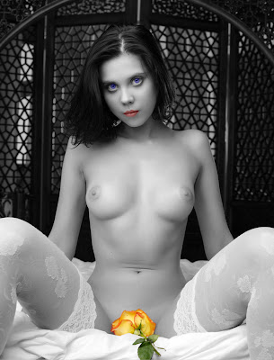
Now initially when I went to a black and white image, I knew I would be pulling the flower out as a point color. But there is just something about coloring a girls lips. Yea I know, its Photoshop... its not like I'm taking some lipstick and gently brushing it over her quivering lips... but it still gets me. The only problem is that her lips are red. I had already altered her eye color (her pale grey eyes didn't stand out when I used the original color on the black and white) and didn't want to mess around with the color of her lips. Here is what I had:
A nice image and looking at it helped me write up the story. But design wise it was a nightmare. I kept flipping around on the background image. I started with a light ethereal look, but it made the dark background in the image stand out. So I went with a far darker background that made our beautiful girl stand out instead. But every time I went to add a color, something was wrong. If I went red/pink, then the flower looked wrong. If I went blue, then her lips and flower looked wrong. Green was just awful. And orange didn't work either. It was really frustrating, and at one point I had a blue background, dark red text boxes, with orange text. Ewwwww.
Thankfully my brain kicked in with the old adage; KISS (Keep It Simple Stupid!). Make here eyes green, and make her lips orange/peach. Now I could focus on those colors. It was an easy choice to go orange in the background, as green was just a little too cooling of a color. Orange on the other hand warmed it up a good deal.
But as I started by saying... I think three is the limit. I find this to be very derivitve of "Please Wake Up". I even had the title as black, with only a glow defining it. I changed it to a solid color JUST to avoid it being to similar. Maybe if I had tackled this earlier... or saved it for tomorrow... it would be better. But after all the work I put into it, I'm done with it. I like it... but I'm done with it.


Wow good one I loveThe wayt you use the image.
ReplyDeleteWHOA! I think this is one of the hottest, squirmiest caps I've read in a while! It's the simplicity that really makes every little remark sing for me. The photo shoot, the mention of the hormones making her clit useless, pretty cupid mouth! Just hot!
ReplyDeleteGreat story and you did an amazing job with the image. It beautifully draws attention to all the right places.
ReplyDelete