


Using the model's name (Ava Rose), I tried hunting down the image she sent, but in better quality. Well while searching through dozens upon dozens of Ava Rose sets, I found this set. I know Alectra liked the model, and loves stockings... but the image she sent me was of Ava in a latex suite. And by my approximation Alectra's love of latex supersedes her love of stockings. So I saved this set back and kept looking.
When I finally sent Alectra some alternate image links to look through (didn't find the original one, but some others from the same set), I came back to these images. I really really liked her poses in these two images. It felt like she was struggling against her body. In the first image I got the sense that she wanted to crawl through the open window and run away, while in the second image she was being forced to experience the pleasure this body could give her.
Obviously I was looking at them in the TG kind of way!
I started writing, but it didn't take long for me to realize that this could be a really good cap. The design would be simple and clean, and the colors were just great (having all the various tans and browns, contrasting against her blue panties and bra). So instead of writing more I went over to the Haven to see if the basic story I had in mind (doctor talking to friend of the transformed, convincing her that the transformed person wanted this, while the person struggles mentally against it) would work with someone else's preferences.
I normally don't do this. I want the person's preferences front and center if I am going to create something specifically for them. But I really like sharing my good caps. I figured I wouldn't look to hard... if I didn't find someone who's preferences this would match up with, I would just make it and post it here exclusivity.
I figured what i would need is someone who wanted brunette hair, revenge, and hypnosis. When I looked at the list of names, I thought back to who I had been wanting to cap. Now I knew the preferences of people on my internal 'to cap' list, and I didn't think this would be the best fit. But then I saw sarinedavis's name.
Ever since Jennifer and I collaborated on "Paris: City of Lights, Love, and Sissies" for sarinedavis, I have wanted to make another cap for her. Not only is she a sweety, but whenever she comments she seems to say more than 'Nice!' or 'Good cap!'. She almost always qualifies her praise, letting me know WHAT she liked about it. And I just adore that.
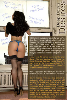
So looking at her preferences I saw that this would indeed fit. To be honest her preferences are fairly open, so almost any cap would work. I liked that as I could write this more freestyle. So I started to write. When I felt I had a good beginning I went into Photoshop and set the design. I thought it was a good breaking point, but I didn't like how I had Diane's protests. On my first pass I had them inline with the text, as if she was thinking of them as her girlfriend and the doctor were speaking. It was o.k... but it really broke up the girlfriend's and doctor's conversation. Plus even putting her thoughts in parentheses and having them a different color made it seem to me that she was saying them, and not just thinking them.
So to fix that I removed them, and put them as 'thoughts' floating around her. I liked it. I felt it was more obvious that she was constantly thinking these thoughts, and that they didn't specifically have to match up with what her girlfriend and doctor were saying at any particular moment.
I then fit the text where I wanted it and moved on. I went back into Word and started writing up the finishing touches. Like a lot of my caps I wanted the 'zinger' at the end... that she and the doctor had previous run ins. I didn't want an obvious statement from the doctor that he was doing this, instead staying with his calm conversation with Diane's girlfriend. So that was one of the first 'thoughts' that I put in "He Did This For REVENGE!".
Of course it wouldn't be a real 'Caitlyn' cap if the writing went perfectly smooth. I ended up having to cut about an entire paragraph from the 2nd panel. I MAY have been able to fit it in, if I didn't want to use a rectangular text box. You can see the extra empty space to the upper left of the text box, above Diane's face. But as I was playing around with that, it just didn't look right. So I cut out some stuff. Primarily it was the girlfriends thoughts about how she liked him (even had his name... Donald) as he was, and how she really regretted him ever coming here. I thought it was nice, but it wasn't necessary. So it got edited out. A few more things, and changing a few phrases made it fit the second panel.
Now I'll be honest, I am always tempted to just use a smaller font, instead of making edits to the story when it doesn't fit right. But I had already set the design in the first panel, and that (to me at least) includes the font size.
Now if anyone is reading this, I would like your opinion on a couple things. These are 'in general' opinions and don't have to reflect this cap in particular. First is the font size. Does it bother you to see different font sizes on various panels of a series cap? Second is horizontal vs vertical. Now I try to respect the image when I decide between making it horizontal or vertical. By that I mean I almost always crop it down to where it needs to be (in my eye), and that determines if its horizontal or vertical. For example, if I was just capping the 2nd image here, I would have probably cropped it vertically, so that it would focus on her. The only reason I didn't here, was the empty space in both photos matched up pretty well, and utlizing it for the text just made sense. But as a whole, do you like it when I change format nid way through a cap series? Does it bother you that I started out with a vertical image then moved to a horizontal image for the 2nd panel?
Anyway... any thoughts or opinions would be greatly appreciated. I'm happy with this one myself!
First of all...
ReplyDeleteYAY for me for making you encounter such an awesome gal! ^-^
Second, I just love how would you drive yourself mad for missing some sign of punctuation in a straight sentence hehe
Third: Because I just started playing with differents fonts in text (rather than the usual or by default) I have to say that it you are planning to make some kind of difference between two speakers, that's cool for me.
( If you know of a place where you can find free fonts to keep experimenting, by all means tell me! )
I don't mind the text going in vertical, horizontal or rotated just as long as Is readable.
(uhmmm my brain is still thinking about studies, so forgive me if I make a mistake!)
Then you should try to play with italics (for important words) or bold type font if you are not already using it for the whole text, to highlight an important thought or a word. ( Such as the start when the Doctor says "deep down". that could go in Italics to refer to something that's not true :) )
If those actions are there to be used, by all means use them. They can bring so much life to text, and some people are just not using it. Caps can be made in an entire different way using them.
And liked the cap too! Is really dark if you think bad (like me) or is sweet if you think bad like sarinedavis *giggle*
Hugs and Kisses Alectra
P.S: The day I'm not fixated on latex, you lot are gonna start thinking I've been abducted or something! *giggle*
I appreciate your thoughts as always Alectra. I try not to obsess to much about punctuation or spelling though. The only time that matters is when it makes a paragraph to long. That's not punctuation at that point... its design!
ReplyDeleteTo get free fonts? Just search for "Free Fonts" on Google. I used to work in design, so I have hundreds of fonts now, and haven't had to search for new ones in a long time. I used to use http://www.1001fonts.com/ but I'm not sure if there is a better site out now.
As for emphasizing words via italics, bold, and colors. I am not opposed to that. As you can see in this cap I used italics and color to differentiate between the two spoken voices (they are both the same font), and another font and color for Diane's voice. I also did use bold in the second panel to emphasize the girlfriend's second OH MY.
But unless it's part of the design (like in "The Girl with the Pretty Tattoos!"), I don't like emphasizing a lot of words in a cap. I like to leave the emphasis to the reader. I try to present a story that can be interpreted in different ways.
And I think you may have misunderstood my question. What I was asking wasn't about the text, but the layout of the individual panels. Does it bother you that the first panel is vertical, while the second panel is horizontal?
Ah forgot to say that :)
ReplyDeleteNo it doesn't bother me...
On the contrary, I plan to do it as a next step for my caps. Just one thing that I don't like about Quark is that I would have to open the next cap in a separate panel to do that. :)
The thing is that, if you want to emphasize the scene depicted in there, you should be free (in my opinion) to work around with that! So don't worry about making it vertical and then horizontal. It adds a new flavor to the whole story.
Besides it's an easy way to resize images, like you told me some other times without making it extra large or too much wide. :)
And thanks for the advice!
I really want to avoid using the same font over and over on the same caps, but not really sure which one should I cover after using the default ones ;)
Hugs and Kisses Alectra
P.S: I would love to be in the other building in front to admire the views *giggle*